PAUSE: BRAND STRATEGY, BRANDING, DIGITAL COLLATERALS AND ART DIRECTION
Client: Pause, Bangalore.
Pause is a brand that promotes clean eating and choosing to lead a healthy lifestyle.
The client wanted to promote not just the food they serve but also the idea of choosing ‘healthy’ over ‘easily available’.
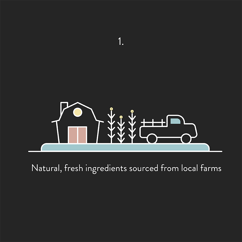
They have their own supply of organically grown farm fresh ingredients which are used to cook in a home kitchen in the cleanest way possible.
Target Group: Office going, young and mid-aged professionals who have the will to have a healthy lifestyle but are always on the go.
Theirs is a subscription based model for the delivery of soups, smoothies, salads, wraps and sandwiches.

brand identity


‘Pause’ essentially means a temporary stop to begin something new; begin again!
It can be regarded as the space that lies between two consequent events. This thought is also congruent with the brand philosophy of taking a pause and making a choice. To represent this particular idea, a symbol such as a semi-colon ’;’ has been used for the branding.

shallot
iceberg
citrus
mint
brand story
brand video